
Litespace Payment Dashboard
Litespace Payment Dashboard
Stripe integrated payment dashboard that increased subscription upgrades by 23%
Stripe integrated payment dashboard that increased subscription upgrades by 23%
Project Type
Professional
Timeline
Mar 2023
Team
Design Lead
2 Engineers
Product Designer (Me)
Contributions
Research
Prototyping
Testing
Project Type
Personal
Timeline
Mar 2023
Team
Design Lead
2 Engineers
Product Designer (Me)
What I Did
• Researched subscription plan structure and billing pain points.
• Designed self serve flows for plan comparison, subscription changes, and billing management.
• Collaborated with engineers to integrate Stripe and align payment logic with user flows.
• Iterated designs to support evolving pricing and business requirements.
OVERVIEW
OVERVIEW
Scalable payment dashboard for subscriptions
Scalable payment dashboard for subscriptions
As a Product Designer at Litespace, I led the 0-to-1 design of a payment dashboard during a period of rapid growth. The company had just achieved first place on Product Hunt, which brought in a surge of new potential users. However, the platform lacked a clear way to communicate and manage different subscription plans, relying heavily on the sales team to explain offerings one by one.
To support scalability and improve self-serve adoption, I designed a dashboard that allowed users to view plans, subscribe, manage payments, and handle billing changes independently.
PROBLEM
PROBLEM
Users struggled with comparing and managing subscription plans
Users struggled with comparing and managing subscription plans
With the influx of new users, it became clear that relying solely on sales-led demos created friction and limited growth. Feedback from early enterprise customers and internal discussions with Design Leads highlighted three main challenges:
With the influx of new users, it became clear that relying solely on sales-led demos created friction and limited growth. Feedback from early enterprise customers and internal discussions with Design Leads highlighted three main challenges:
Unable to compare different plans
Unable to compare different plans
Users had no direct way to evaluate various plans inside the platform, making it difficult to choose the right fit without sales intervention.
Users had no direct way to evaluate various plans inside the platform, making it difficult to choose the right fit without sales intervention.
Unable to review billing information
Unable to review billing information
After subscribing, users could not easily access billing details, invoices, or order history to track costs.
After subscribing, users could not easily access billing details, invoices, or order history to track costs.
Unable to manage the subscription
Unable to manage the subscription
Users wanted a smooth process for upgrading or canceling plans, but these actions required additional support from the sales team.
Users wanted a smooth process for upgrading or canceling plans, but these actions required additional support from the sales team.
CONSTRAINTS
CONSTRAINTS
Adapting to dynamic subscription plans
Adapting to dynamic subscription plans
The company’s fast-paced growth meant subscription plans were still evolving during this project. As the designer, I supported the team by researching and validating plan details such as features and pricing. Since the monthly plan had not yet been finalized, I focused first on designing the yearly subscription flow. In addition, limited engineering resources required us to evaluate different payment methods and select the most practical option.
The company’s fast-paced growth meant subscription plans were still evolving during this project. As the designer, I supported the team by researching and validating plan details such as features and pricing. Since the monthly plan had not yet been finalized, I focused first on designing the yearly subscription flow. In addition, limited engineering resources required us to evaluate different payment methods and select the most practical option.
RESEARCH
RESEARCH
Learning from industry standards to improve the payment experience
Learning from industry standards to improve the payment experience
Since payment flows are a common feature in SaaS products, I began with a competitive analysis to benchmark against industry standards. I studied subscription management, order history, cancellations, and plan switching across leading SaaS platforms.
Since payment flows are a common feature in SaaS products, I began with a competitive analysis to benchmark against industry standards. I studied subscription management, order history, cancellations, and plan switching across leading SaaS platforms.

Users desire a straightforward process to upgrade and cancel plans. Modern SaaS products prioritize easily locatable cancellation buttons.
Users desire a straightforward process to upgrade and cancel plans. Modern SaaS products prioritize easily locatable cancellation buttons.

Users cannot remember all features, so listing key elements that differentiate various plans is crucial for informed decision-making.
Users cannot remember all features, so listing key elements that differentiate various plans is crucial for informed decision-making.

Users appreciate having access to their billing history to keep track of records. Transparency fosters trust between the product and its users.
Users appreciate having access to their billing history to keep track of records. Transparency fosters trust between the product and its users.

Companies that employ third-party payment methods often offer superior experiences. This observation led to the decision to use Stripe to manage different flows comprehensively.
Companies that employ third-party payment methods often offer superior experiences. This observation led to the decision to use Stripe to manage different flows comprehensively.
RESEARCH
RESEARCH
Identifying common pain points in SaaS subscriptions
Identifying common pain points in SaaS subscriptions
To better understand user frustrations, I reviewed online resources, forums, and SaaS user feedback. I identified six recurring pain points that informed the payment dashboard design:
To better understand user frustrations, I reviewed online resources, forums, and SaaS user feedback. I identified six recurring pain points that informed the payment dashboard design:
Complex Pricing
Complex Pricing
Many SaaS platforms use multi-tier pricing based on users, features, and usage, often leaving customers unsure of what they’re paying for.
Many SaaS platforms use multi-tier pricing based on users, features, and usage, often leaving customers unsure of what they’re paying for.
Billing Errors
Billing Errors
Users might encounter problems with incorrect charges, double-billing, or being charged for a service they didn't use or cancelled.
Users might encounter problems with incorrect charges, double-billing, or being charged for a service they didn't use or cancelled.
Lack of Transparency
Lack of Transparency
Users often complain about hidden fees, unexpected price increases, or lack of clarity about what they're being billed for.
Users often complain about hidden fees, unexpected price increases, or lack of clarity about what they're being billed for.
Difficulties in Managing Subscriptions
Difficulties in Managing Subscriptions
Users might find it hard to upgrade, downgrade, or cancel their subscription, or switch between different plans.
Users might find it hard to upgrade, downgrade, or cancel their subscription, or switch between different plans.
Poor Customer Support
Poor Customer Support
If users encounter a problem or have a question, they may struggle to get timely and effective help from customer support.
If users encounter a problem or have a question, they may struggle to get timely and effective help from customer support.
Security Concerns
Security Concerns
Users might worry about the security of their payment information, particularly if the dashboard doesn't provide clear information about security measures.
Users might worry about the security of their payment information, particularly if the dashboard doesn't provide clear information about security measures.
IDEATION
IDEATION
Three design focuses for the MVP
Three design focuses for the MVP
We distilled research into three principles to shape a self-serve subscription experience that scales without sales involvement.
We distilled research into three principles to shape a self-serve subscription experience that scales without sales involvement.
Clarity
Clarity
Simplify plan selection by surfacing the key differences that matter most, offering a quick compare view and a clear recommended option.
Simplify plan selection by surfacing the key differences that matter most, offering a quick compare view and a clear recommended option.
Transparency
Transparency
Make billing understandable at a glance with next charge, billing period, taxes and discounts, proration preview, and downloadable invoices.
Make billing understandable at a glance with next charge, billing period, taxes and discounts, proration preview, and downloadable invoices.
Flexibility
Flexibility
Enable self-serve changes without support: upgrade, downgrade, cancel, and switch cycles, with instant confirmation and optional scheduled changes.
Enable self-serve changes without support: upgrade, downgrade, cancel, and switch cycles, with instant confirmation and optional scheduled changes.
CHALLENGE 1
CHALLENGE 1
Determining Stripe integration level
Determining Stripe integration level
The team chose Stripe, a secure and scalable payment platform known for its fast integration, to avoid building a complex custom system. A key challenge was determining the integration level. As a designer, I researched and collaborated with the team to adopt full Stripe integration, balancing benefits and risks to streamline development and ensure a seamless payment experience.
The team chose Stripe, a secure and scalable payment platform known for its fast integration, to avoid building a complex custom system. A key challenge was determining the integration level. As a designer, I researched and collaborated with the team to adopt full Stripe integration, balancing benefits and risks to streamline development and ensure a seamless payment experience.

Partial use of Stripe targets its strengths and minimizes dependency, but can complicate integration, create payment inconsistencies, and increase costs with additional services.
Partial use of Stripe targets its strengths and minimizes dependency, but can complicate integration, create payment inconsistencies, and increase costs with additional services.
Full Stripe integration provides a one-stop payment solution with consistency and extensive tools, but it could be vulnerable to Stripe's downtime and may miss niche features.
Full Stripe integration provides a one-stop payment solution with consistency and extensive tools, but it could be vulnerable to Stripe's downtime and may miss niche features.
CHALLENGE 2
CHALLENGE 2
Streamlining user flows with Stripe
Streamlining user flows with Stripe
Another key design challenge was integrating Stripe into our Payment Dashboard to handle varied financial interactions seamlessly. I tackled the challenge of seamlessly incorporating Stripe by analyzing similar tools and mapping user journeys for plan changes. This led to creating refined mock-ups for our development team.
Another key design challenge was integrating Stripe into our Payment Dashboard to handle varied financial interactions seamlessly. I tackled the challenge of seamlessly incorporating Stripe by analyzing similar tools and mapping user journeys for plan changes. This led to creating refined mock-ups for our development team.

FINAL DELIVERABLES
FINAL DELIVERABLES
Simplifying plan selection and updates
Simplifying plan selection and updates
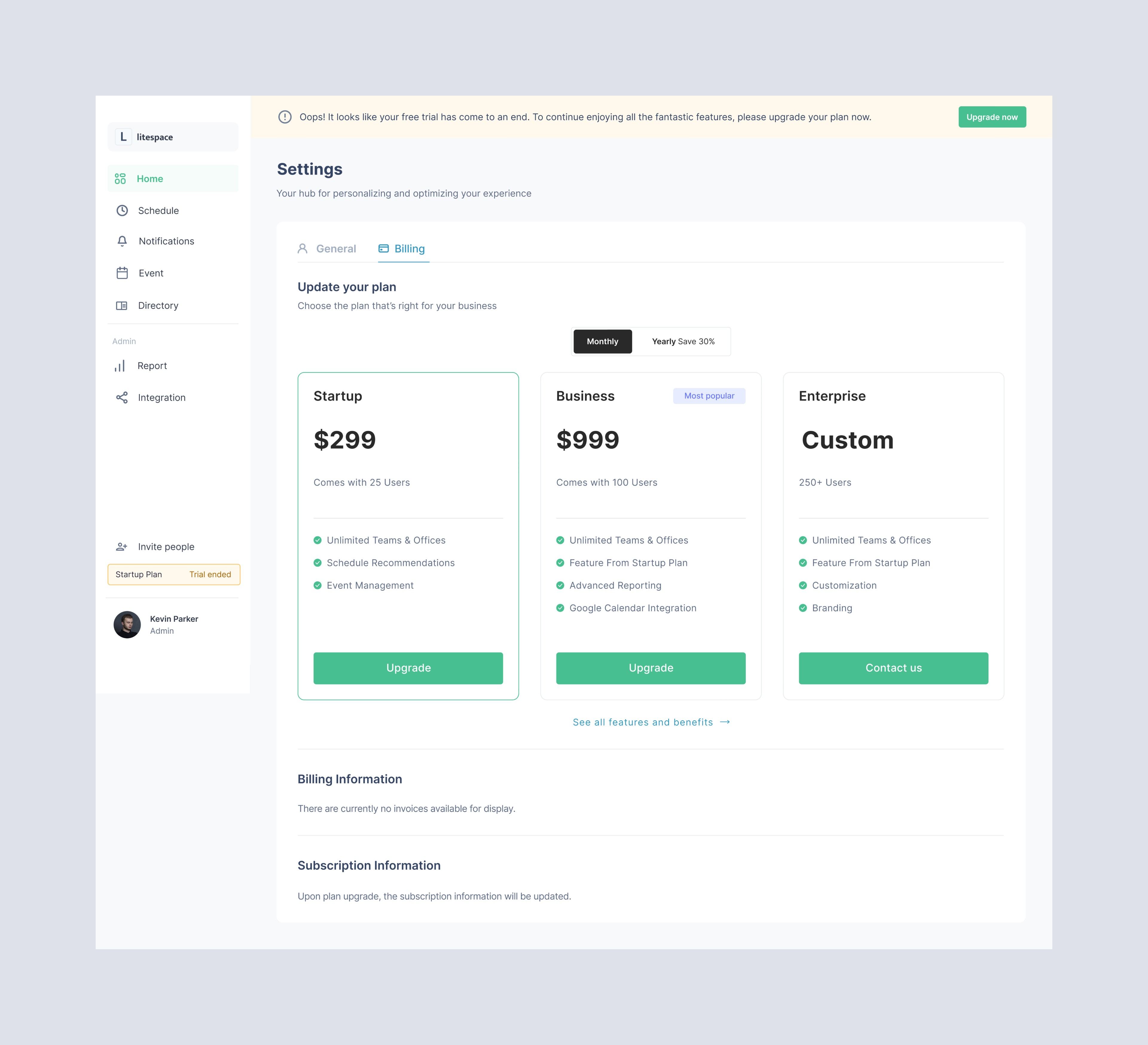
I designed a price card highlighting each plan’s benefits to simplify multi-tier pricing, balancing clarity and transparency. Showing only the current plan avoids confusion but limits comparisons, while displaying all plans can overwhelm users. Directing those needing detailed information to the marketing site ensures simplicity without sacrificing choice.
I designed a price card highlighting each plan’s benefits to simplify multi-tier pricing, balancing clarity and transparency. Showing only the current plan avoids confusion but limits comparisons, while displaying all plans can overwhelm users. Directing those needing detailed information to the marketing site ensures simplicity without sacrificing choice.

Billing and subscription management
Billing and subscription management
The billing information section allows users to review past bills and download invoices with one click, promoting transparency and trust, and addressing concerns about incorrect charges or hidden fees.
To solve the issue of users struggling to alter or cancel their subscription, Stripe provides a dedicated page for managing subscription information. Here, users can easily edit payment details and update or cancel their plans.

Regardless of whether a user chooses to cancel or downgrade their plan, understanding their reasoning is beneficial. Therefore, I propose incorporating a survey into the downgrade and cancellation process.
Regardless of whether a user chooses to cancel or downgrade their plan, understanding their reasoning is beneficial. Therefore, I propose incorporating a survey into the downgrade and cancellation process.

Trial banner for upgrade reminders
Trial banner for upgrade reminders
I devised a notification banner to remind users of trial period expiration and the need to upgrade. The decision to include a trial plan came post-initial design due to shifting business requirements, prompting me to revise the original mock-ups to integrate this new feature.
I devised a notification banner to remind users of trial period expiration and the need to upgrade. The decision to include a trial plan came post-initial design due to shifting business requirements, prompting me to revise the original mock-ups to integrate this new feature.
REFLECTION
REFLECTION
I led the design of a payment dashboard for our SaaS application, integrated with Stripe, which the company launched in March 2023. The dashboard enabled seamless plan management and marked a significant user experience improvement, ultimately driving a 23% increase in plan upgrades in the first month. This project deepened my understanding of user-centric design and the importance of addressing diverse scenarios.
I led the design of a payment dashboard for our SaaS application, integrated with Stripe, which the company launched in March 2023. The dashboard enabled seamless plan management and marked a significant user experience improvement, ultimately driving a 23% increase in plan upgrades in the first month. This project deepened my understanding of user-centric design and the importance of addressing diverse scenarios.

© 2026 Chang Mou. Crafted with 💪 and ❤️